Tuesday 28 December 2010

Post Production Results: Front Cover

The Magazine Front Cover

For the magazine front cover, I interviewed nine people. The majority of which were ofcourse male, yet I wanted a female opinion also, and so I included two females in the interview. Some of the people questioned were media studies students; their opinion was important to me in that they can answer the questions in a more technical fashion. I also questioned those with a background in media, so they have a basic understanding. I also questioned those with no experience in the subject at all, this way I can avoid any bias answers and recieve the perspective of simply a fan of film.
Here, I will state what questions were asked, whilst presenting examples of answers.

Looking at the front cover, would you say its overall appearance looks professional?

" I could easily mistake it for one you'd see on the shelves! I like the simple and clean layout as well as the minimalism within the choice of colours." 

"It bears resembelence to popular film magazines out there now which makes it look professional."

"Yes it has a proffesional appearance, with the simple layout and use of colours holding a resemblance to film magazines which can be found in store."

"You have clearly followed the codes and conventions of existing film magazines and this allows the front cover to look professional and authentic."

Would you say that this front cover is aimed at a male target audience?

"The mode of address would appeal to a male target audience by featuring females and using the sell line 'The Foxiest Females'. The other types of films that can be seen on the front cover such as 'Jackass 3D' and 'Of Gods and Men' reflect a male target audience. There isn't too much text filling up the page, which is another sign that hints towards a male publication, as men tend to avoid text heavy pieces (they prefer to be informed of things visually). Which brings me to my next point, perhaps you could have used more images, in order to further entice the male audience and to fully address your intended audience."

"It is clear to me that this magazine is aimed at a male target audience as it features interviews with mainly males and is promoting films that are aimed at men."

"I can tell that the audience you are aiming your magazine at are male through the uses of sell-lines and featuring an attractive woman on the front cover, however, I do feel that the main sell-line is slightly too feminine. The pink, italic script font is slightly off-putting."

"The films and actors mentioned would suggest that it is aimed at a male target audien...ce. This is also supported by the simple layout and bold colours which are used."

"This magazine is obviously aimed at a male who is interested in film, because there are interviews inside with mainly males who are associated with the movie industry. Also, the film reviews include mainly films that appeal to males."

What genre of magazine would you say this is and why?

"The magazine is clearly a film magazine, from the content mentioned."

"It's clearly a publication that celebrates movies, due to the inclusion of films listed and actors/ directors."

What does the magazine name "Playhouse" tell you about the magazine and does it appeal to you?

"The name is an alternative word for 'cinema' and it also contains sexual elements. Therefore I believe the title itself is informative that it's genre focuses on film and that it's aimed at male readers."

"The name entices me because it sounds naughty and quite playful!"

"The name playhouse would suggest a more fun take to film, there are also sexual connotations which I personally find very appealing. The name alone, makes me want to read the magazine!"

"The name informs me that this is a publication about film. I like how you've integrated a sexual nature into the magazine name, in order to entice male readers."


Are the sell-lines informative? Does the content appeal to you?

"Yes, they inform the readers what they can sepcifically expect to find inside the magazine."

"The sell-lines are informitive and clearly inform the reader of what they will expect to find inside the magazine. The sell-lines also reinforce that it is a film magazine. The big names which are mentioned would help attract the readers interest. The sell-line "Screen-Sirens" would also be affective in bringing in the male readership."

Do you think the Masthead and Sell-lines are effective?

"I love the masthead. It stands out to me the most and draws me in as it is different and interesting. The style of font used for the masthead looks old-fashioned which is inkeeping with the theme of the film (considering the model is dressed in 1940's attire and the main sell-line includes the words "forties glamour")."

"The mast head reminds me of the opening sequence of 'Agatha Christies Poirot' giving a slightly 'Art Deco' feel to the magazine; this certainly has a strong effect on me. I also think the sell-lines are effective in that they appeal to and will attract men."

"The mast head would draw me in, as the font used has a classic film vibe to it. The sell-lines are simple, and this helps to engage the male readership."

"The masthead and sell-lines stand out against the plain, white background. They catch my attention and draw me in."

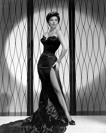
 Do you think the image has a professional or amateur look about it?

"The image definately looks professional as the quality of the image is high. The elements of mise-en-scene are stunning!"

"The pose of the actress and the facial expression of the actress help give the image a proffesional appearance. The positioning of the image on the page gives it a proffesional appearance in terms of a magazine cover."

 Looking at the image, what film would you say is being promoted?

"I would say it's perhaps it's a murder mystery set in the 1920's/ 30's period."

"Perhaps it's set in the 1960's, including some kind of murder plot."

"The sell-line and image tell me that it is a classic movie probably based in old classic england, like agathe christie sort of theme. From looking at the image i would say it is in the genre of a classic horror; most likely gothic."

What areas of the front cover most appeal to you?

"The mast head, with its resemblence to classic film font. Also the layout as a whole appeals, as it clearly informs the audience of what they will receive from the magazine."


"I would say that the image and main sell-line are most effective because they stand out the most and give a very strong indication as to what the film is about."


"The film that it is featuring draws me in the most as the image doesn’t give away much detail, making me want to know more about the film and the character that ‘Val’ plays."


In what areas do you think I could have improved?


"I think that the script font seems slightly feminine for a male targeted magazine."


"The sell-line relating to "forties galmour" wouldn't really appeal to a male audience, and they would probally not wish to read an actresses opinions on it. Also the font used for "Val Vixon" may not appeal to a male audience."


Do you think I have accurately followed the codes and conventions of a magazine?


"Yes it follows the codes and conventions of a magazine, and it also fits the conventions relating to a magazine for a male audience."


"Yes because they all appeal in a way that makes the reader want to buy it and something that they would enjoy as well."


What Have I learnt from this?


According to those who were interviewed, I have clearly achieved an authentic and professional looking front cover. This is due to the combination of minimalism and sophistication integrated within a tidy, uncluttered layout. As well as the content and organisation of the Masthead and sell-lines and the quality of the image. I have clearly followed the correct codes and conventions for magazines, yet my audience understood my need to be original with my ideas.
The content of the sell-lines clearly attract a male target audience, yet the readers were slightly repelled by the use of a feminine font and colour within the main sell-line. I have also successfully established the genre of the magazine due to the content of the sell-lines.
One of the things I am most pleased about is that my audiences were very much attracted to the title of the magazine. They're thoughts and opinions towards the mastheads were my exact intentions! From looking at the image, the style font used for the masthead and reading the main-sell line my audience were able to gain some kind of idea of what the film was about. 
Over all, I believe my audiences found my front cover to be successful in that it targets the correct audiences, is informative of it's genre/ film being promoted and looks professional. 

Monday 27 December 2010

Post Production Questionnaires

In order to access a wide range of my target audience and save time, I decided to construct my Post Production Questionnaire over a social networking site - Facebook!

The Film Magazine


(Using mode of address to establish a rapport with my interviewees!)


The Film Poster


I'm currently awaiting feedback!

Thursday 16 December 2010

Problem Solved.


Finally! I have managed to upload all of my footage onto Premier Pro and have officially started editing! I just hope all of my bad luck is over now and that I can finally get on with what I set out to do. 

Fingers crossed that the rest of the project will flow smoothly!

Wednesday 15 December 2010

Even more technical problems...

There has been progress with my footage; we have managed to convert the files and upload them onto Premier pro. However, instead of being uploaded in separate clips, the footage has been uploaded in one huge chunk. When I attempted to trim the clips, it turned out that the clips were unable to play. 

Using an editing programme on Mac, I have managed to cut the footage into separate clips. However I am at the moment unaware of whether they'll actually play in premier pro. I am so sick and tired of having to go to extra lengths to sort out my footage. I feel like I'm constantly battling problem after problem and I'm so terrified of this effecting the quality of my work and my grade.

If these separate clips still are unable to work on premier pro tomorrow, I guess I'll have to use an alternative editing programme. 

Sunday 12 December 2010

It's a wrap!

A few shots from behind the scenes of the last day of filming 'The Affliction of Evelyn'.

The calm before the storm.
A 9 am start for us all...

Cast Photo's


A big thank you to my actors, Anastasia and Jack. You were both amazing! Sorry for screaming at you both all day.

xx

Film Trailer Soundtrack!

Looking for songs from the 1900's - 1940's. One song must have a melancholy vibe to it, that's sad and simplistic and contains whimsical elements. Preferably just an instrumental piece. 

Also looking for one that is strong, orchestral and dramatic.

Anything kind of spooky and supernatural. 


I quite like this one!


A few Inspirational Images


The Final Pieces: The Film Poster and Magazine Front Cover


I am extremely pleased with the way in which my poster turned out. Although a few changes have been made to the layout, I am happy that I stuck by my initial ideas and that my vision was a success! The only thing I altered was the removal of the ghost child in the corner and I tweaked the tagline. Seeing as the poster no longer contained an additional character from the film, to have the tagline read 'united by pain' no longer made sense, and so I changed it to 'plagued by pain' as it refers to only the main character. There is no specific date stated or institutional information because I wanted this to stand as a teaser film poster.


I have to admit that I did find the process of creating the magazine front cover quite stressful. Having become immerssed within the world of filming and directing I feel as if I have discovered a hidden talent! Since beginning the process of constructing the still images, I felt as if my creativity was stunted and found it difficult to create a piece that looked authentic.

After playing around with different colours, fonts and placing pieces of text in different places, I felt like I finally found something that looked okay. Although I am not entirely satisfied with the results of my magazine and I even though I feel I have let myself down slightly, I am content in that I am starting to learn where my strengths lie within this creative subject.

Music Suggestions for Film Trailer

Due to the lack of proper sound equipment, I have decided it would be best not to include dialogue within my film trailer. Therefore, I will have to rely on the music and sound effects to entice my audiences. This post shows some very basic ideas of the sort of music I will be using.

Melancholy Soundtracks to Existing Films:


I don't particularly want to use a soundtrack for a film that already exists, as I wanted to research the era itself. I am currently searching for songs that are representative of the time, have jazzy undertones, reflect the melancholy mood and hint towards the supernatural genre of the film.

Saturday 11 December 2010

Technical Problems

For my filming, I decided to use a camera from home  which was a Sony HandyCam. After filming the first few scenes for my trailer I was extremely pleased with the results. The quality of the footage was brilliant and the shots I took looked authentic. I brought the disc of the footage into school to put onto the computers in order to begin editing. Little did I know that the footage wasn't the right format in order to convert files onto the computer or that the files were incompatible with premier pro. 

I contacted the IT professionals within school to help me with these technical problems and am still awaiting feedback.

Tuesday 7 December 2010

Creating the Film Poster

The Unedited Image


This is the original image that I selected to use for the poster. I feel like the compositioning within the frame was extremely representative of my initial ideas and I am so pleased that my idea of the poster turned out to be successful. 

Using Adobe Photoshop CS5 I turned this image into a film poster to promote my film. This post follows the process of editing the image and creating the poster.

In order to create an even and flawless complexion, I used the blur tool and spot-healing tool to blur and remove blemishes around the face. I wanted the model to portray the look of a classic 1940's beauty and so I started with the lashes. Zooming into the eyes I used the sharpen tool to make the lashes appear more defined; using the smudge tool to make them longer and create a feathery effect. I also used the burn tool to make that area of the eye darker to draw more attention. The result of this lengthened the lashes.

To create the look of perfectly chiseled cheek bones, I used the burn tool again (increasing the size) and swiped it across the cheek. The same method was used along the jaw line in order produce a more defined bone structure.

Next I used the colour replacement tool to redden the lips. Below are two examples of the change in colour of the lips:


After I decided on the appropriate colour I used the burn tool to darken the lips.

The dodge tool was used to lighten the hair and give it a glossier, shinier and healthy effect. The blur tool  was successful in eliminating the wispy bits around the head. The burn tool was effective in darken the areas of fur and the dodge tool was used to lighten other areas of the scarf. Around the edges of the fur, the sharpen tool was used to define and make it stand out.

The models arm in the image is darker than her face, in order to create an even skin tone I used the sponge tool to make the complexion of the arm look as pale as the face.

Next I wanted to change the colour of the image to create the vintage look, I played around with the hue/saturation to provide the image with a sepia tone.


This is just one example of the effects of changing the hue/saturation. This example will not contribute towards the final piece.

The final part of editing included applying the text to the image, such as the tagline, film title and the date.

The final piece will be shown in a later post.

Monday 25 October 2010

Mock-ups for the Film Poster & Film Magazine Front Cover


Characters Names & Film Title

Characters Names
A characters name can reveal a lot about their persona and so it is vital that I select appropriate names that are suitable of the era and representative of the characters personalities.

Potential Names for the Protagonist:
Fern
Penelope
Hazel
Florence
Alice
Grace
Evelyn
Rose, Rosaline, Rosalie
Lillian

I have chosen to name my main character Evelyn as it has a lady-like, feminine gentleness to it, but it also contains an essence of strength with its inclusion of the letter ‘V’.

The Ghost of the Girl:
Robin White
I am very fond of the name Robin for its obvious connotations with birds and associations with the concept of freedom. It fits the narrative as the protagonist must solve the solution of the ghosts traumatic past and set her spirit free. I like how the name contradicts this character in the beginning, as at first she is seen to be this evil spirit tormenting Evelyn. As the narrative progresses we learn more about the ghost and that her personality resembles that of a sweet, chirpy, beautiful little bird.

The surname was chosen simply because it represents the innocence and purity of her character. The colour white also has connotations with religion.

Potential Names for the Antagonist:
Walter
Victor
Vincent

I have chosen to call this character Vincent, because the name contains a darkness to it, which reflects his sinister character. Yet, it also has a slight and subtle softness to it, which portrays a weakness to him. 


The Film Title
Finding a name for my film required a lot of thought and consideration. Initially I wanted to find a name that reflected the idea of facing your fears, fighting your demons; something that indicates a journey or the process of self discovery or self healing because it simply hints towards the narrative. As my ideas developed, I thought that I needed something that portrayed the supernatural horror genre.

Firstly I considered producing a film title that relates to a haunted house or an eerie street name as it is conventional of the sub genre, For example “Amityville Horror”, “Last House on the Left”, “The House on Haunted Hill”, “Elm Street” and so on. However I felt this root was too obvious and wouldn’t truly represent the narrative as the focus isn’t on the location.

I then thought about associating the film name with some kind of encounter with evil, to give it more of a supernatural-horror kick. Then again, the film is not a story about evil; the narrative is centred on the concept of some kind of penance or absolution for the protagonist. Instead of including the protagonist’s name in the film title, I also considered using the name of the ghost girl or maybe even the protagonist the antagonist. 

Examples of potential titles:


Involving the protagonist:
- Evelyn’s Revelation
- The Affliction of Evelyn
- The Apparition of Evelyn
- Evelyn’s Ghosts

Involving the ghost:
- The Apparition of Robin White
- The Haunting of Robin White

Involving the Antagonist:
- The Conviction of Vincent Webb

I have decided to name my film, 'The Affliction of Evelyn' because the word 'affliction' refers to pain and harm, which is what each of my characters experience within the narrative. 
It also reflects the supernatural horror genre with it's association with pain and suffering. It's an old fashioned word that is rarely used today and so it fits in with the 1940's era and the language in which they used. Also having the characters name as part of the title also reflects the 1940's theme, as it is an old name (popular for new born girls in the 1920's!) Over all I find the title enchanting, endearing and classically sophisticated, not only will it compliment the image of my main character but it's informative as to the genre, the narrative and the theme. I could not be happier with my choice of title!

Shooting Schedules and Call Sheets


Practise Shots for Magazine and Film Poster

A basic idea of the look I want to create:


Final Ideas: Film Magazine

In the last post concerning ideas for the magazine I had established that I was going to produce a film publication targeted towards a male audience. Since then, I have further developed my ideas and this post sees the formation of my thought process.
The Masthead
Naming my magazine required a lot of thought and consideration. I knew from the beginning that I needed to find a suitable name that reflected the fact it is a male publication that focuses on film. I brainstormed alternative words that represent ‘film’ and wanted to avoid the most obvious choices.
Alternative words associated with film that can be used as the masthead for my magazine:
Take-One
Originally, this name started as just ‘take’ but by adding a number to it, the connection with film becomes more apparent. I like this idea because its representative of the magazine however I am apprehensive that the target audience will fail to immediately associate it with film.
Roll
I found this name to be quite quirky, edgy and cool and in that respect it is representative of the characteristics of the target audience. However, I feel that perhaps the word is more associated with music than it is with film.
Flick
I’d like this to be the name of my magazine because it’s an old fashion term for cinema, which I find quite endearing within its self and of course it’s in keeping with the tone of my project. However, I decided that perhaps the word isn’t masculine enough.
Hot Ticket
The masthead will be accompanied by a sexed up image of my protagonist seeing as it’s for a male publication, and so including the word ‘hot’ in the masthead will add to the magazines sexual appeal. ‘Ticket’ refers to cinema, as a whole it suggests that this is a magazine that is about the hottest new films.
Playhouse
This word is also an old term for the ‘cinema’. I like this name because when you read it you think ‘Playboy’ which means it has sexual annotations, which will attract a male target audience immediately! Also, the fact that it is an old fashion expression is very endearing.
The Main Image


Inspired by the image of Megan Fox on ‘Total Film’ magazine, I will take a medium shot of my protagonist, with her back to the camera, looking over her shoulder. Her stance will adopt the poise and sexual seduction of Ava Gardner, yet the innocent, child-like expression will resemble that of Marilyn Monroe.


The Main Sell-line
The main sell-line will focus on the feature of the actress rather than the film. I’m thinking of creating a main sell-line that features the name of the actress and a sub description that explains how she has broadened her horizons as an actress, by moving away from the male orientated films. This would explain why she is featured on the front cover of the male publication.
Additional Sell-lines
Colour Scheme
Uses of red, black and greys. Colours that appeal to men as they are strong and dominant, primary colours.

Final Ideas: Film Poster

Film Poster
Image
A medium shot of the character with her back to the camera, looking over her shoulder. An additional image will be a blurred silhouette of the little ghost girl in the corner of the page. An idea that was inspired by the film poster for “Changeling”.
Name
“The Affliction of Evelyn” which will be situated along of the bottom of the page in the centre.
Tagline
“United by Pain. Redeemed by Revenge.

Final Ideas: Film Trailer Narrative

In the beginning of the trailer we see a shot of the exterior of the house, we then see the main character step into this frame, at which point we can only see her feet, and that she is carrying a suitcase. The camera pans upwards revealing the back of the woman. The camera then moves 180* around the woman's head, exposing her face in the final shot. The camera cuts to an extreme long shot, showing her approaching the house which is visible in the background. 

The purpose of these beginning shots is to introduce the protagonist. Instead of exposing her abruptly on the screen, there is a build up of curiosity as to what she looks like within the use of camera movement. Also the purpose of using a panning shot to reveal the back of the character, adds to her mystery and also reveals her clothing to be that of a past era (indicating the time period in which the film is set.)

This cuts to a shot of the 'house next door'. The camera cuts-in closer and closer to a specific window of the neighbours house, and eventually reveals an old lady peeking through the curtain. The purpose of this shot is to introduce the character, it also sets a creepy and mysterious tone, hinting towards the genre of horror.

This fades into a scene where we see the main character unpacking her belongings in a bedroom of the house. This indicates that she has moved in, but also that she is lonely is this cold, empty room.

This fades into a shot where the same room is dark and the character is asleep, we see this through a birds-eye-shot of her lying in bed. She begins to toss and turn.

This fades into her 'dream sequence' in which we see a little girl spinning around in the garden (in slow motion) on a warm summers day. This cuts to a shot of the gardener watching her from afar, with a perverted expression on his face. This cuts back to the girl still spinning and then bumping into the gardener who is towering over her. This cuts to 'reality' showing the protagonist in bed having a bad dream. The camera cuts back to the dream sequence, and there is a low angle close up shot of the gardener handing the little girl a flower. The camera cuts to an extreme close-up shot of the flower in his hand and the little girl reaching out to take it, at which point he aggressively and forcefully grabs her arm. The camera cuts back to the protagonist and she wakes up.

The next shot shows her browsing the attic of the home and stumbling across an old book. She looks through it and discovers that this home was once an orphanage. The camera reveals the name of the orphanage and the photographs of the children. The woman discovers one photo in particular that stands out to her, it was the girl from her dream. As she holds it up, the ghost of the girl appears in front of her.


We then see the protagonist involving herself in a séance, trying to contact the ghost. The camera does a 180* pan around her, and then cuts to an extreme close-up of her closed eyes. As she opens them we can see the reflection of the girl.


Then the fast paced editing begins... (these clips aren't necessarily in order, but they give an idea as to which clips I shall be using in this section of the trailer)


- we see a message in which the little girl leaves for the woman, which indicates to audiences that the ghost wants the protagonist to help her.
-The protagonist holding the photograph of the gardener and writing down his name on a piece of paper, which we see her show a man at the barracks.
- The trailer shows him in a long shot standing there dressed in gardening attire, a graphic-match is used to then show him dressed in his military uniform.
- We see the protagonist and the antagonist dancing at a party.
-We see them under silhouette lighting by the water side, becoming romantically linked.
-The protagonist getting ready to go the party, (putting on her stockings, applying her red lipstick, getting dressed)
-We see the protagonist look into the reflection of her mirror and scream.
-The antagonist thrown onto the bed, having been stripped of his military attire.
-The antagonist hold the protagonist up against the wall by her neck, in a close up shot.
-Flashbacks of the little girl dancing/ being dragged along the floor/ standing in the house drenched in blood.
-Flashbacks of the gardener, a worm-shot of him leaning over the camera (the dead girl) holding a bloody garden fork.

Practise Shots: The Ghost Child

The Ghost Child


Costume

Although the white flowy dress isn't totally representative of the 1940's era, it suited the ghost aspect of the character. I wanted a flutterly fabric that floated through the air; this will compliment her sweet, soft and gentle nature.

Hair

Long and loose curls, the dark blonde colour just makes the character appear more angelic. The pink bow emphasises the purity and innocence of the young girl. 

Make-up

The look I went for was nuetral, pale lips and contouring of the cheekbones and lower eye lids.