In the last post concerning ideas for the magazine I had established that I was going to produce a film publication targeted towards a male audience. Since then, I have further developed my ideas and this post sees the formation of my thought process.
The Masthead
Naming my magazine required a lot of thought and consideration. I knew from the beginning that I needed to find a suitable name that reflected the fact it is a male publication that focuses on film. I brainstormed alternative words that represent ‘film’ and wanted to avoid the most obvious choices.
Alternative words associated with film that can be used as the masthead for my magazine:
Take-One
Originally, this name started as just ‘take’ but by adding a number to it, the connection with film becomes more apparent. I like this idea because its representative of the magazine however I am apprehensive that the target audience will fail to immediately associate it with film.
Roll
I found this name to be quite quirky, edgy and cool and in that respect it is representative of the characteristics of the target audience. However, I feel that perhaps the word is more associated with music than it is with film.
Flick
I’d like this to be the name of my magazine because it’s an old fashion term for cinema, which I find quite endearing within its self and of course it’s in keeping with the tone of my project. However, I decided that perhaps the word isn’t masculine enough.
Hot Ticket
The masthead will be accompanied by a sexed up image of my protagonist seeing as it’s for a male publication, and so including the word ‘hot’ in the masthead will add to the magazines sexual appeal. ‘Ticket’ refers to cinema, as a whole it suggests that this is a magazine that is about the hottest new films.
Playhouse
This word is also an old term for the ‘cinema’. I like this name because when you read it you think ‘Playboy’ which means it has sexual annotations, which will attract a male target audience immediately! Also, the fact that it is an old fashion expression is very endearing.
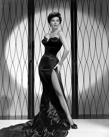
Inspired by the image of Megan Fox on ‘Total Film’ magazine, I will take a medium shot of my protagonist, with her back to the camera, looking over her shoulder. Her stance will adopt the poise and sexual seduction of Ava Gardner, yet the innocent, child-like expression will resemble that of Marilyn Monroe.
The Main Sell-line
The main sell-line will focus on the feature of the actress rather than the film. I’m thinking of creating a main sell-line that features the name of the actress and a sub description that explains how she has broadened her horizons as an actress, by moving away from the male orientated films. This would explain why she is featured on the front cover of the male publication.
Additional Sell-lines
Colour Scheme
Uses of red, black and greys. Colours that appeal to men as they are strong and dominant, primary colours.


No comments:
Post a Comment