Film magazines celebrate films from both the past and present and provide it's target audiences of avid film fans with information on newly anticpated releases as well as interviews with the biggest actors and directors of the moment. The most successful film publication in the UK is ‘EMPIRE’, with 'Total Film' standing firmly in second place, these film publications focus on populist titles which attracts a wider target audience. The target audience who read film magazines are largely male dominated and they are of course hard-core film fans. In order to appeal to men, the magazines are mainly image orientated with little text. Allow us to discuss the codes and conventions of film publications:
Specific genres of magazine have conventional ways of exhibiting their main image. For instance, with Fashion magazines, the shot in which is used for the image would typically be a medium shot of the model. With beauty magazines, it's common for there to be a close up shot of the model so that the face is clearly shown on the front cover. With film magazines, it's a little different. The shots used for the main image vary depending on the film and how many models are featuring on the cover.
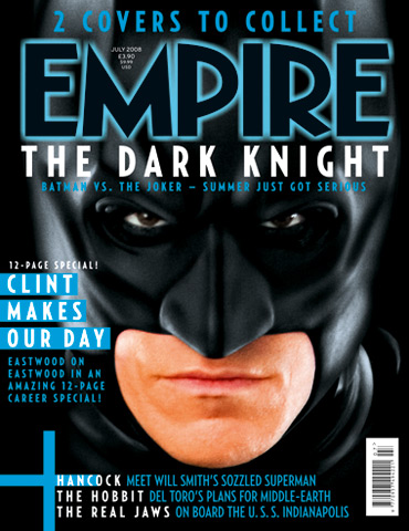
Sometimes you will see film magazines using extreme close-ups, close-ups, medium shots, long shots and ones that contain more several film characters.
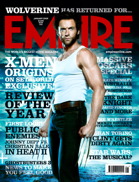
Film magazines conventionally have a masthead situated at the top of the page, which is the largest piece of text on the page. It dominates the page drawing attention to itself.
'Empire's signiture colour is red, as it is a male associated primary colour, which is eye catching.
With some issues, the masthead will change colour or it's style to suit a specific movie theme.
In order to draw in audiences, film magazines rely hugely on stars as unique selling points. By featuring someone famous on the front cover and plastering famous names over the cover, not only will you attract your intended target audience but you are likely to entice a wider range of people, who are solely interested in the star.
For instance, using Megan Fox on the front cover of the issue is likely to draw in more than just film fans, but fans of the actress who wouldn't usually purchase a film publication.
The main sell line is the second biggest piece of text which is conventionally placed in the bottom centre of the page. For magazines in general, this is unconventional as the main sell line is situated to the bottom left corner. Having it placed in the centre, allows it to stand as the focal point of the magazine having additional features surrounding it.
Graphics and colours are interchangeable, depending on the featured film. For example, if a horror film was being featured on the front cover, the colour themes would contain dark hues with splashes of red. If the issue was featuring a fantasy, family film, the colours would be lighter and softer pastel tones. Action films featured on the front cover commonly exhibit colours that are rich, deep and masculine. The maximum amount of colours used for a front cover is up to three.


this is really nice to read..informative post is very good to read..thanks a lot! buy dvd stranger things season 2
ReplyDelete